
Admiral’s Wallpaper reproduction
Welsh Castle
Blue wallpaper
facsimile
Case study
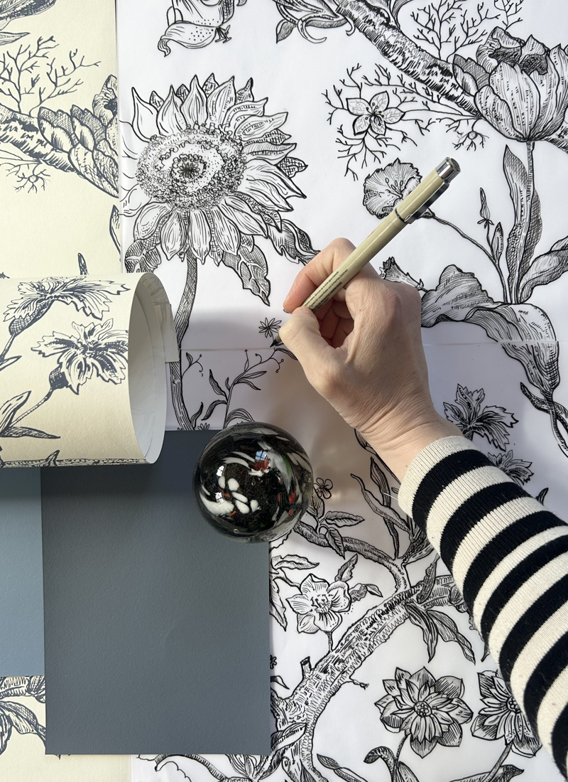
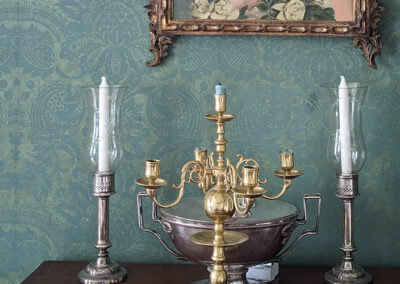
The reproduction of the Blue Chintz wallpaper from the Admiral’s bathroom required several consultations with the client. It was agreed that the new design would be an interpretation of the original, as the reproduction could only be based on photographic evidence and not all areas of the wallpaper pattern were visible in the images provided.
Due to this loss of information, a decision was made to introduce a personalised element by adding a small number of flowers chosen by the client. For this reason, roses- our client’s favourite were incorporated into the reconstructed design, ensuring the final pattern remained faithful to the historic aesthetic while reflecting the client’s personal connection to the space.
Process
Research and pattern analysis
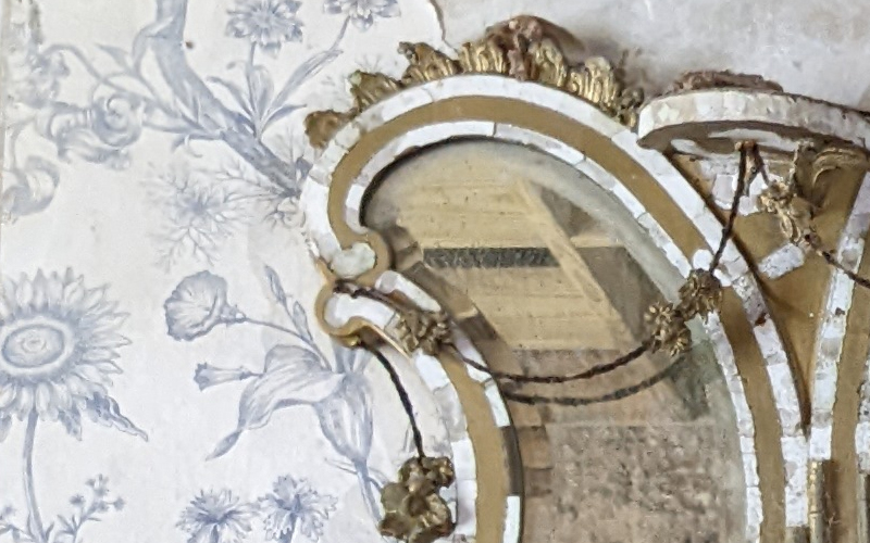
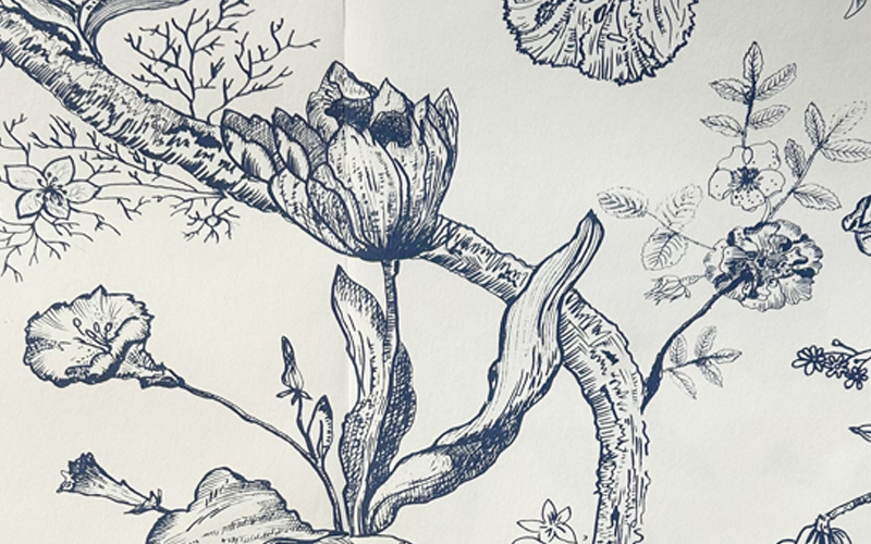
The reproduction of the Blue Chintz wallpaper from the Admiral’s bathroom required several consultations with the client. Extensive research and design mapping were undertaken using the available photographic documentation, which formed the primary source for reconstructing the pattern. As not all sections of the original wallpaper were visible in the photographs supplied, it was agreed that the new design would be an interpretation rather than a strict facsimile.
Wallpaper facsimile process
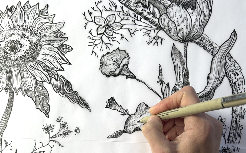
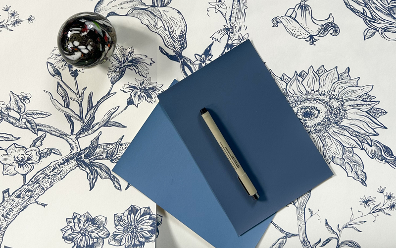
The facsimile reproduction was hand illustrated and to address areas where information was missing, a personalised element was introduced: the client selected a small number of favourite flowers to be incorporated into the reconstructed motif. For this reason, roses were added to the design, ensuring that the final composition remained faithful to the historic aesthetic. The colour palette was selected entirely by the client, who wished to create a version of the Blue Chintz wallpaper that felt both historically sympathetic and personally meaningful.
Interior Design scheme
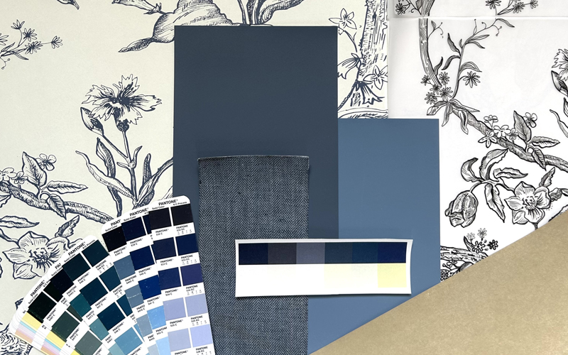
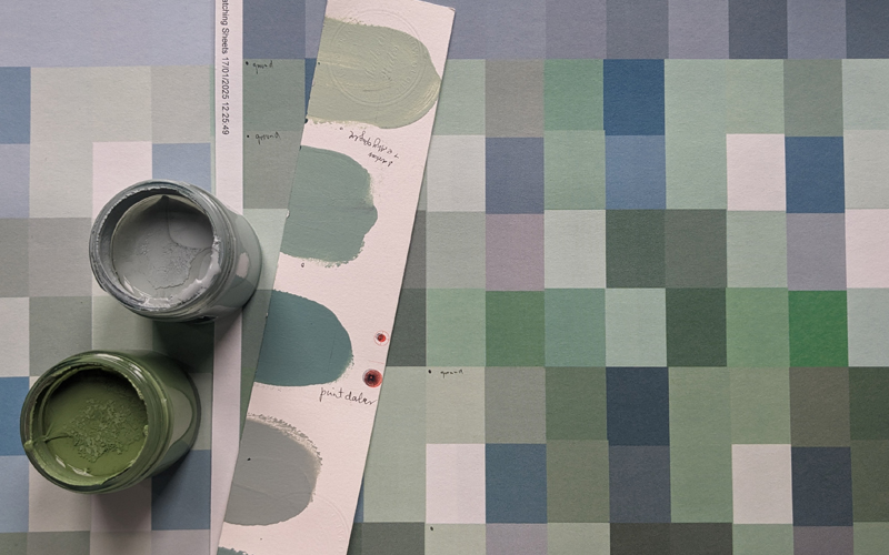
Several colour studies were prepared and reviewed during the consultation process, allowing the client to compare tonal variations and assess how different hues interacted with the reconstructed floral motifs. The complementary paint colours for the wooden panelling were selected from our Emulsion collection. After reviewing several options, the most suitable shade was identified as Love in the Mist, a grey‑blue with deeper tones that provides a refined contrast to the wallpaper’s warmer ground colour of Clotted Cream. This pairing enhances the overall harmony of the scheme, allowing the cooler panelling to frame and elevate the richness of the reproduced wallpaper.
Gallery
Contact
justyna@justynamedon.uk